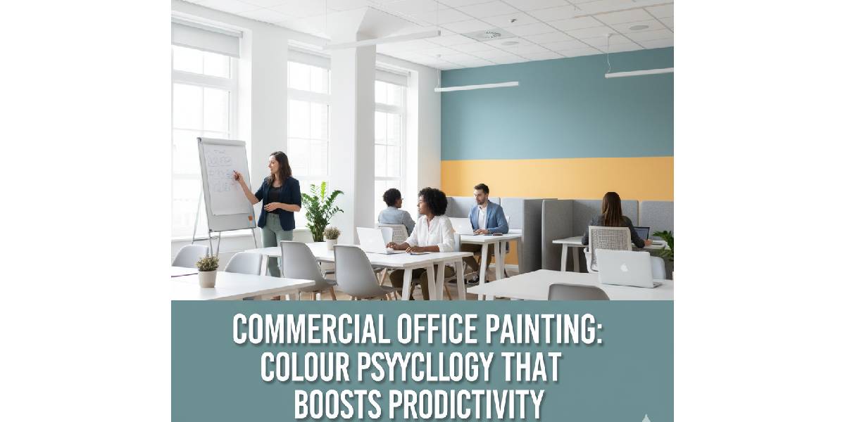
Choosing the right paint for your workplace goes far beyond decoration. It directly impacts focus, mood, and performance. Understanding office paint colour psychology helps you select shades that motivate your team, boost collaboration, and create a workspace where people enjoy being productive.
A fresh coat of paint is not just about aesthetics. It’s a silent productivity tool.
Studies show that colour influences behaviour by up to 60%, affecting everything from creativity to energy levels.
Offices with balanced, well-planned colour schemes see 20–30% higher employee satisfaction and reduced stress levels compared to dull, monotonous environments.
Whether you’re refreshing a small office or upgrading a large corporate space, choosing the right palette can transform how people feel and perform each day.
In this guide, we’ll break down:
- How colour psychology works
- Which shades bring out the best in your team
- And how commercial office painting can turn any workspace into a more inspiring, focused environment.
Understanding Colour Psychology in Offices
Colour psychology in the workplace isn’t a creative theory; it’s science-backed design. Each colour triggers a specific emotional and physical response. When applied strategically in commercial office painting, it can enhance concentration, calmness, creativity, and even communication.
Before choosing your palette, it’s essential to consider your office layout, lighting, and the kind of work your team does. Bright, saturated colours energise, while softer, muted tones reduce stress and encourage focus.
The key is balance.
A workspace that blends stimulating colours with relaxing accents helps employees stay alert without feeling overwhelmed.
The Best Colours for Productivity
Below are the most effective workplace productivity colours, supported by colour psychology and real-world results from modern offices.
Each of these tones can be mixed with accent colours or feature walls to maintain visual interest while keeping focus intact.
| Colour | Psychological Impact | Best Use Areas |
| Blue | Promotes calm focus and logical thinking | Ideal for meeting rooms, accounting, or tech departments |
| Green | Reduces eye strain and supports balance | Suitable for open offices or shared spaces |
| Yellow | Sparks creativity and optimism | Perfect for design teams or brainstorming areas |
| White / Off-White | Creates a clean, spacious feel | Reception areas, small offices |
| Soft Grey | Encourages sophistication and neutrality | Executive offices and boardrooms |
| Muted Terracotta / Warm Beige | Adds warmth and approachability | Client areas or collaborative corners |
Blue
Blue enhances focus, clarity, and accuracy. It’s one of the most trusted office colour ideas for logical or detail-oriented workspaces such as IT firms, finance teams, or analytics departments.
It creates a sense of calm and order, allowing employees to process information efficiently.
To prevent blue-heavy rooms from feeling cold, pair them with soft white ceilings or light wooden accents.
Here’s a tip:
- Use lighter blues in small spaces to create openness.
- Go for deeper navy tones in leadership areas like admin blocks for authority and confidence.
Green
Green embodies calmness, health, and balance. It helps reduce fatigue caused by long screen hours, which is why it’s considered one of the best colours for productivity in open or hybrid offices.
It mimics nature, bringing tranquillity to high-pressure environments and making people feel more relaxed and connected.
Simple ways to apply it:
- Paint feature walls in sage or olive green for subtle energy.
- Use plants or artwork with green tones to complement the wall colour.
- Combine with white trims to keep it modern and bright.
Yellow
Yellow inspires creativity and energy. It’s the perfect choice for design studios, marketing teams, or brainstorming rooms where ideas flow fast.
It stimulates optimism and communication, but must be used carefully. Too much yellow can be overstimulating; it works best as an accent or feature tone.
How to use yellow effectively:
- Paint one wall or highlight zones like break areas.
- Pair it with neutral tones such as grey or white for balance.
- Choose muted or pastel yellows for a soft, positive atmosphere.
White and Off-White
White is timeless and versatile. It reflects light, making offices look larger and more open. When paired with the right furniture and lighting, it promotes mental clarity and calm.
However, pure white can sometimes feel sterile. To prevent this, off-white shades or warmer undertones like ivory or cream keep the space welcoming.
Best use cases:
- Reception and waiting areas.
- Smaller office spaces.
- Work zones where cleanliness and focus are essential.
Grey
Grey adds professionalism and balance. It works beautifully in modern corporate settings, giving depth without distraction.
It’s ideal for spaces that require composure and quiet thinking, such as boardrooms or private offices. However, too much grey can feel dull. Soften it with wooden textures or warm lighting.
Smart tips:
- Use light greys in combination with white trims.
- Add coloured artwork or green plants to avoid monotony.
Terracotta and Warm Beige
These shades introduce warmth and authenticity, balancing professionalism with a sense of comfort. They are increasingly popular in commercial interior paint
ing in Australia, where businesses aim for modern yet inviting workspaces.
Warm earthy tones make clients feel at ease and encourage informal collaboration among employees.
Where they shine most:
- Client lounges or meeting areas.
- Communal zones and staff kitchens.
- Spaces where natural light enhances their richness.
How to Apply Colour Psychology Strategically
The best office environments use colour zoning, assigning colours to specific areas based on the kind of work performed. This approach allows each area to support productivity in its own way without overwhelming the senses.
| Office Zone | Purpose | Recommended Colours |
| Focus Zones:
● Private offices ● Work pods ● Study corners |
Concentration | Blue, soft green |
| Collaboration Areas:
● Meeting rooms ● Brainstorming spaces ● Shared desks |
Communication | Yellow, beige |
| Breakout Zones:
● Lounges ● Kitchenettes ● Staff resting areas |
Relaxation | Terracotta, sage |
| Reception or Client Zones:
● Reception desk ● Waiting lounge ● Client meeting areas |
First impressions | Off-white, grey |
Lighting and Finish Matter Too
Even the best colour can fail under poor lighting or an unsuitable paint finish.
Natural light enhances cooler colours, while artificial lighting may shift tones slightly. Always test paint samples on different walls before finalising your palette.
Finish tips:
- Use matte or eggshell finishes for walls (reduce glare).
- Semi-gloss for trims and doors (durable and easy to clean).
- Avoid high-gloss finishes in workspaces; they can reflect too much light and strain the eyes.
It Is Concluded That:
The science of office paint colour psychology is simple. The right colour can make people:
- Work smarter
- Feel better
- Stay longer
A thoughtful palette enhances morale, productivity, and the overall image of your brand.
If you want expert help creating a workspace that looks beautiful and performs better, contact Luxury Design Painting. Our specialists of commercial office painting in Australia help businesses choose colours that inspire productivity, balance, and focus. Every single day.

