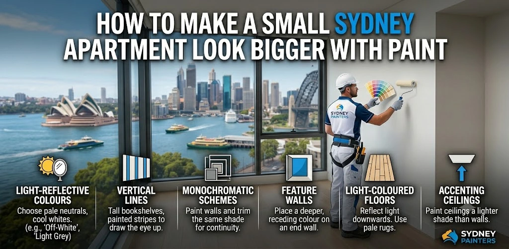
Making a small Sydney apartment look bigger with paint requires selecting light reflective colour palettes, extending ceiling colours above natural sight lines, using strategic accent walls drawing eyes toward depth, matching trim to wall colours, eliminating visual breaks, and maintaining colour continuity across connecting spaces, creating uninterrupted flow.
Small apartments dominate Sydney’s housing market across suburbs, including Potts Point, Darlinghurst, Neutral Bay, and the CBD. Paint colour, sheen selection, and application technique transform spatially constrained apartments without structural modifications, furniture replacement, or significant renovation work.
The right apartment painting Sydney strategy delivers immediate, dramatic spatial improvement without touching a single wall.
Light Colour Palettes Expanding Small Sydney Apartments
Light colour palettes expand small Sydney apartments by reflecting natural and artificial light throughout spaces, reducing shadow depth in corners, and preventing colour contrast from visually breaking up already compact floor areas.
Colours measuring high on the Light Reflectance Value (LRV) scale deliver the most noticeable spatial expansion in small apartments. LRV simply measures how much light a colour reflects.
The higher the number, the more light bounces back into the room.
Light colours, including soft whites, warm creams, and pale neutrals, sit high on this scale, keeping rooms feeling bright and open. Popular choices in Sydney apartments include Dulux Lexicon Quarter, Dulux Natural White, and Taubmans Antique White USA, all warm, welcoming tones that reflect well without feeling stark or clinical.
Sydney apartment orientation affects which light tones work best. North-facing apartments receiving consistent natural light suit slightly cooler whites and soft greys. South-facing apartments with limited direct sun benefit from warmer cream tones, preventing cold, shadowy appearances. East and west-facing apartments experience light shifts throughout the day, requiring colours performing well under both warm morning and cool afternoon conditions.
Avoid 3 common colour mistakes in small Sydney apartments
- Saturated feature colours on multiple walls create visual weight, compressing room dimensions.
- Cool grey tones in south-facing rooms amplify shadow depth, creating smaller appearances.
- High-contrast combinations between walls and ceilings create hard boundaries, reducing perceived ceiling height dramatically.
Ceiling Colour Techniques: Adding Visual Height
Ceiling colour techniques add visual height to small Sydney apartments by changing where the eye naturally perceives the boundary between walls and ceilings.
Ceiling colour extension
Ceiling colour extension involves painting ceilings the same colour as walls or one shade lighter, then continuing that ceiling colour a short distance down the wall below the cornice or picture rail. This removes the hard horizontal line where the wall meets the ceiling, making the room feel taller than it actually is.
Vertical stripe techniques
Vertical stripe techniques draw eyes upward, increasing perceived height. Subtle vertical lines using the same colour in different sheens (flat on walls, satin on stripes) create a sense of height without introducing colour contrast, disrupting the room’s flow.
Ceiling tinting
Ceiling tinting matters more than most people realise. When apartment walls are already light, pure white ceilings can actually make the room feel lower by creating excessive contrast. Tinting ceilings to a slightly softer version of the wall colour reduces this contrast while keeping the ceiling feeling bright.
Professional apartment painters Sydney-wide consistently identify ceiling treatment as the single most impactful technique for improving how a large or small apartment feels.
Strategic Accent Wall Placement in Small Spaces
Strategic accent wall placement in small Sydney apartments draws the eye toward depth rather than width, directing attention along the longest available sightline, creating an illusion of greater room length.
Place accent walls on surfaces at the end of the longest sight lines. In rectangular living rooms, the wall opposite the entry point draws eyes across the full room length. In bedrooms, the wall behind the bed head creates depth when viewed from the doorway. In narrow hallways, an accent wall at the far end lengthens perceived corridor dimensions.
Avoid accent walls on the side walls of narrow rooms. Side wall accents emphasise width rather than depth, visually compressing already narrow spaces. Entry walls immediately inside doorways create visual stops rather than drawing eyes through the space.
Accent wall colours work best when staying within a few shades of the main wall colour rather than introducing strong contrasting tones. Subtle tonal variation creates depth without visual compression. The goal is drawing the eye forward, not stopping it in its tracks.
Sheen Selection for Light Reflection in Apartments
Sheen selection for small Sydney apartments affects how much light surfaces reflect and redistribute throughout compact spaces, with slightly higher sheen levels amplifying available light from windows and artificial sources.
Satin finishes outperform flat and low-sheen finishes in small apartments by reflecting noticeably more light from surfaces. This reflection bounces light from windows deeper into rooms, reduces shadow accumulation in corners, and creates a subtle luminosity, making spaces feel airy rather than enclosed.
Kitchen and bathroom walls benefit from semi-gloss finishes, delivering strong light reflection and practical cleanability. Living areas and bedrooms suit satin, balancing reflection with the ability to hide minor wall imperfections. Flat finishes absorb light, making small spaces feel darker and smaller. Generally not recommended for compact Sydney apartments.
Ceilings perform best in flat or low-sheen white, preventing glare from overhead lighting while maintaining general brightness from reflected floor and wall light.
Trim and Skirting Board Colour Tricks
Trim and skirting board colour dramatically affects perceived room size through the visual boundaries created between floors, walls, and ceilings in compact Sydney apartments.
Matching trim to wall colour eliminates visual interruptions that segment rooms into horizontal bands. Standard white skirting boards against light grey walls create 3 distinct zones, including floor, skirting, and wall, making ceilings appear lower and rooms feel narrower. Painting skirting boards, architraves, and door frames the same colour as walls removes these boundaries, creating continuous vertical surfaces appearing taller and wider.
Door frames painted to match walls visually expand doorway openings, making connecting spaces feel integrated rather than separated. This continuity between rooms proves particularly effective in small Sydney apartments where the visual connection between living areas and bedrooms significantly affects overall spaciousness.
Reserve white trim only when walls are mid-tone or darker. White trim against deep tones creates elegant contrast without the spatial compression it causes against near-white walls.
Colour Continuity Creating Flow Between Small Rooms
Colour continuity across connecting small rooms in Sydney apartments creates uninterrupted visual flow, making the total apartment area appear larger than individual room sizes suggest.
Using identical or closely related colours throughout open-plan living, dining, and kitchen areas eliminates the visual stops created by colour changes at doorways. Eyes move continuously through connected spaces perceived as one larger area rather than several smaller individual rooms.
Hallways benefit most from colour continuity strategies. Hallways painted in matching tones to adjoining rooms become visual extensions of those spaces rather than narrow transitional corridors. A narrow hallway in a contrasting colour reads as a compressed gap. The same hallway in matching tones disappears visually into the rooms it connects.
Apartment painting Sydney professionals recommend selecting a single base colour and using 3 variations across apartment zones. Lightest in enclosed areas, standard in main living spaces, and a slightly deeper variation in bedrooms, creating comfort without spatial contradiction.
Luxury Design Painting provides professional colour consultation services, helping Sydney apartment owners select coordinated palettes, maximising spatial perception before full apartment painting programs commence.
Conclusion
Your apartment isn’t too small. It’s just painted wrong.
Most Sydney apartment owners accept spatial limitations as fixed realities when they are actually paint decisions waiting to be made differently. An apartment feeling cramped with dark walls, white trim interruptions, and ceiling colour breaks can feel genuinely spacious with the right colour strategy, including the same furniture, same layout, same windows, completely different spatial experience.
The size of your apartment is fixed. How large it feels is not.
Stop accepting a cramped apartment as your reality. Contact Luxury Design Painting for expert colour consultation and professional apartment painting in Sydney. Our interior painters Sydney deliver spatial transformation through strategic colour selection and precise application, making every room work harder for you.
