In 2025, the top paint colours for interior which are trending in Australia are:
- Sage / Olive green
- Clay / Terracotta-based neutral
- Creamy white (rather than stark white)
- Deep ink-blue or burgundy accent
- Greige as base neutral
These are the perfect choices when deciding for wall paint colour ideas in 2025.
But remember that paint doesn’t just add colour. It protects, defines, and changes how your home feels every single day.
When you’re choosing interior paint colours in Australia, it’s worth understanding what’s trending, what works here, and what will look great in your space now. And still look good in five years.
Let’s discuss what’s really shaping the trending interior paint colours in 2025, and how you can make smart, durable choices.
What These Trending Colours Actually Look Like?
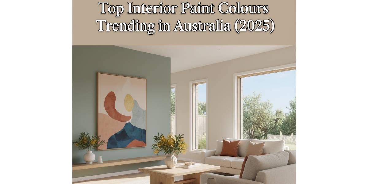
1- Sage and Olive Green
- Imagine the soft green of eucalyptus leaves or the muted tone of olive branches at dusk.
- These greens aren’t loud. They’re grounding.
- On walls, they create a calm, nature-inspired backdrop that pairs beautifully with timber floors, beige linen, and indoor plants.
- Perfect for homes that open to the outdoors or want a touch of serenity inside.
2- Clay and Terracotta Neutrals
- These shades echo the earth.
- Sunbaked clay, terracotta pots, or dusty desert tones.
- They carry warmth without feeling heavy, giving walls a subtle glow that shifts beautifully in natural light.
- They pair well with rattan, oak, and white trims, adding a hint of Mediterranean charm to modern spaces.
3- Creamy Whites
Think of fresh cream rather than bright white paint.
Creamy whites soften harsh light, creating a more natural glow that works perfectly in sunny Australian interiors.
They make small rooms feel open but never sterile.
A go-to for a balanced, long-lasting base.
4- Deep Ink-Blue and Burgundy Accents
These tones add depth and drama.
Picture the rich blue of twilight or the subtle red of a vintage wine.
Used on a single wall or cabinetry.
They bring instant character to a room, grounding open spaces and highlighting architectural features.
5- Greige
A blend of grey and beige, greige is the colour that quietly ties everything together.
It’s flexible, warm enough for wooden textures, cool enough for modern finishes.
Imagine the calm of stone with a touch of sand; that’s greige, the dependable base of 2025 interiors.
Why 2025 is packing in more personality?
In many Australian homes we’re moving beyond purely safe neutrals. We still want calm and livability, but we also want spaces with warmth, texture and identity. The latest interior colour trends show up in these key themes:
| Earthy, nature-inspired hues | Soft greens like olive and sage are gaining traction as “new neutrals”. |
| Warmed-up neutrals and tone-on-tone finishes | Think greige, clay-based hues, creamy whites instead of cool whites. |
| Rich accents and moody contrasts | Deep blues, burgundies and saturated colours appear in feature walls or accent spaces. |
So when you’re picking best interior paint colours,
it isn’t just about:
- “What do I like?”
But also about:
- “What will age well in this light, climate and layout?”
What’s trending right now and actually works?
Here are a few palettes you’ll see showing up in Australian homes right now
1. Green tones as the new calm
Soft, muted greens are replacing what used to be “safe beige”. A hue like sage, olive or eucalyptus brings a sense of connection to the outdoors (especially effective in homes with lots of timber or stone).
When to use: Bedrooms (for rest), bathrooms (for calm), accent cabinetry.
Why it matters: Homes in Aussie climates benefit from colours that don’t feel cold or sterile. Green keeps it warm, grounded.
2. Warm neutrals and subtle whites
Whites are still very much in use. But the rules have changed. Instead of bright, “clinical” whites you’ll see warmer whites (cream, raw-linen, soft clay) that help the space feel lived-in and inviting.
Also, greige (a mix of grey + beige) and clay-undertone neutrals are gaining footing.
When to use: Entire homes, especially open-plan living where you want flow.
Why it matters: These tones work better under Australian light (which can be harsh) and help create a base that complements furniture and textures.
3. Statement hues for feature walls or accent zones
If you’re feeling bold, deeper colours like navy/ink-blue, burgundy, terracotta or even muted pinks are trending.
When to use: Dining rooms, media walls, nooks, perhaps a door or cabinetry to add impact without overdoing.
Why it matters: They add character and depth to your home rather than everything feeling flat, especially good in older homes or large open spaces needing definition.
How to choose for your home: three simple tools
Here are some practical ways to pick what works for you.
| Consideration | What to ask | Quick tip |
| Light & aspect | Does the room get a lot of direct sun or is it shaded? | South-facing rooms benefit from warmer neutrals. |
| Material & existing finishes | What floor, trim or cabinetry colours are present? | If you have warm timber, lean warm white or greige. |
| Purpose of space | Is this a restful area, high-traffic space or feature zone? | Bedrooms: calm greens/neutrals. Dining: richer colour. |
Also:
- Test your selected colour on the actual wall, at different times of day. What looks great in shade may look very different in afternoon sun.
Final Word
Selecting your interior paint colour isn’t about following every trend; it’s about making a decision that will still feel right in your home after a few years. The trending interior paint colours in 2025 give us a nudge towards warmer neutrals, nature-based colours and thoughtful accents. All grounded in real Australian homes, light and materials.
At Luxury Design Painting we believe the right colour choice sets the feeling of your home. How you greet it every day, how you relax in it, how it adapts as your furniture and lifestyle evolve.
If you’re unsure which palette will work best for your space or climate, we’re here for honest insights and expert guidance. Paint isn’t just a colour choice. It’s how your home greets you every day.
